The Most Unusual Kits of the 2026/27 Season
Football shirts are rarely subtle, but this season three clubs went further than most: Carlisle United, Stoke City and Atlético Morelia. Here is what each one looks like and why it exists.
Every August brings a new batch of kits, and a few always stray far from the club-colours template. A roundup of the 2026/27 season, built on ESPN's list of the wildest jerseys, picks out designs inspired by vintage aircraft, local farming, railways and desert storms. Three of them stand apart for different reasons: one is loud, one is historical and one is closer to a painting.
At a glance
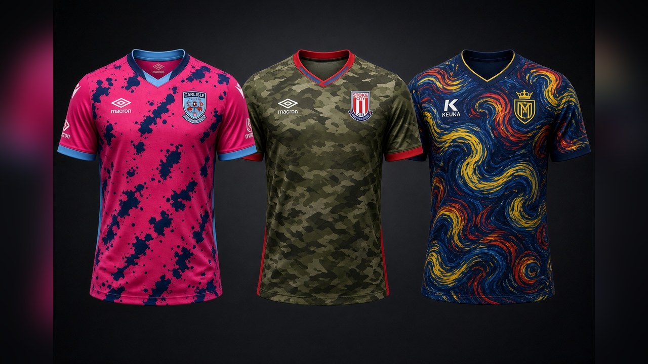
- Carlisle United (away, Macron): a vivid pink base covered in irregular dark blotches, with light-blue details.
- Stoke City (away, Macron): green and brown camouflage based on early Spitfire paint schemes, with red and blue cuffs echoing RAF roundels.
- Atlético Morelia (away, Keuka): a fully patterned shirt of swirling brushstrokes in dark blue, yellow and red, described by ESPN as a visual take on a chronic migraine.
Carlisle United: the pink one
Carlisle's away shirt, made by Macron, is built on a bright pink base scattered with irregular dark navy and black blotches, with light-blue touches on the collar and sleeves. It is the loudest design of the three and, unsurprisingly, the one most likely to split opinion: you either love a kit like this or you do not.
Bold away kits are one of the few places where clubs can take a risk, since the home shirt keeps the traditional look. Whether the pink and navy find fans or not, it will certainly be noticed on the road.
Stoke City: a Spitfire tribute
Stoke's Macron away shirt has the clearest story. Its camouflage graphic is inspired by the early paint schemes used on Spitfires when they first entered service, in traditional green and brown tones. Red and blue details on the neck and cuffs recall the roundels that marked early Royal Air Force aircraft.
The shirt honours Reginald Mitchell CBE (1895–1937), the aeronautical engineer who designed the Supermarine Spitfire and was born in the Butt Lane area of Stoke-on-Trent. According to Macron, the retail version carries the inscription “RM / Spitfire” at the back of the neck and a small Spitfire outline with Mitchell's name on the front. The kit will be worn in the EFL Championship.
Atlético Morelia: art, or a migraine
Morelia's away shirt, from the brand Keuka, is covered edge to edge in chaotic brushstrokes of dark blue, yellow, red and blue, a look that recalls Van Gogh's Starry Night. ESPN's description was less romantic: a visual interpretation of a chronic migraine.
The club itself framed it differently. It called the shirt a piece as unique as a work of art that evokes the magical nights of the Canario, with an artistic, mystical touch that it says defines the team. Morelia play in Mexico's Liga de Expansión MX.
Which one works?
Taste is personal, and these three show why clubs keep taking risks. Stoke's shirt has a story and a historical anchor, Morelia's has an artistic claim, and Carlisle's relies on colour alone.
The fuller roundup also includes designs from Dortmund, Cologne, Leipzig, Lokomotiva and Avellino among others. If you could pick one to wear at the stadium, which would it be?
Sources: ESPN's 2026/27 kit roundup as summarised by World Today News (6 October 2026); Macron, Stoke City away kit announcement (18 July 2026); MiMorelia (23 July 2026). Kit images are illustrative.
Related Content
Premier League 2026/27: How Have the New Managers Started?
MLS and the USMNT: How 30 Years of American Soccer Shaped the 2026 World Cup Team